Center for Contemporary Arts Prague
www.fcca.cz 2006–2024
- Author
-
Jiří Skála
- Year
- 2004
About work
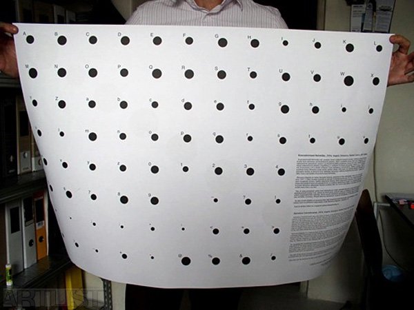
Helvetica Concentrated, 2004
Angela Detanico, Rafael Lain and I designed the font Helvetica Concentrated, which takes the form of black circles of various sizes. The size of the individual circles is derived from specific letters, figures and symbols of the font Helvetica Regular. This is how using the architectural programme AutoCAD we measured the area of the individual letters (e.g., I of the size 50 points has an area of 21.77 square millimetres; W of the same size 76.82 square millimetres). None of the letters, figures and symbols of the Helvetica font has the same area. Then we converted these areas to the radiuses of circles, from which we subsequently derived the sizes of individual circle-signs of the new font called Helvetica Concentrated.
Helvetica Regular is a famous font. It was created by Max Miedinger in 1957. Its visual form combines high Modernism of the 1950s and total restraint in visual expression. Another important fact that helped Helvetica to become one of the most frequently used fonts of the 1990s was the support of Apple. At that time, Helvetica was the basic font of the system Mac Os, which is one of the reasons why we opted for this particular font.
By changing the established forms of individual letters of the Latin alphabet and concentrating them in the most perfect form as possible, which is the circle, we tried to touch the very substance of this means of communication – to live again through the experience of learning a sign which carries a certain meaning. The first encounter with the alphabet at school is just such an experience. 2004
Photo